At the Epicenter
Project Description
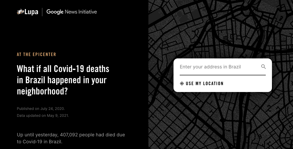
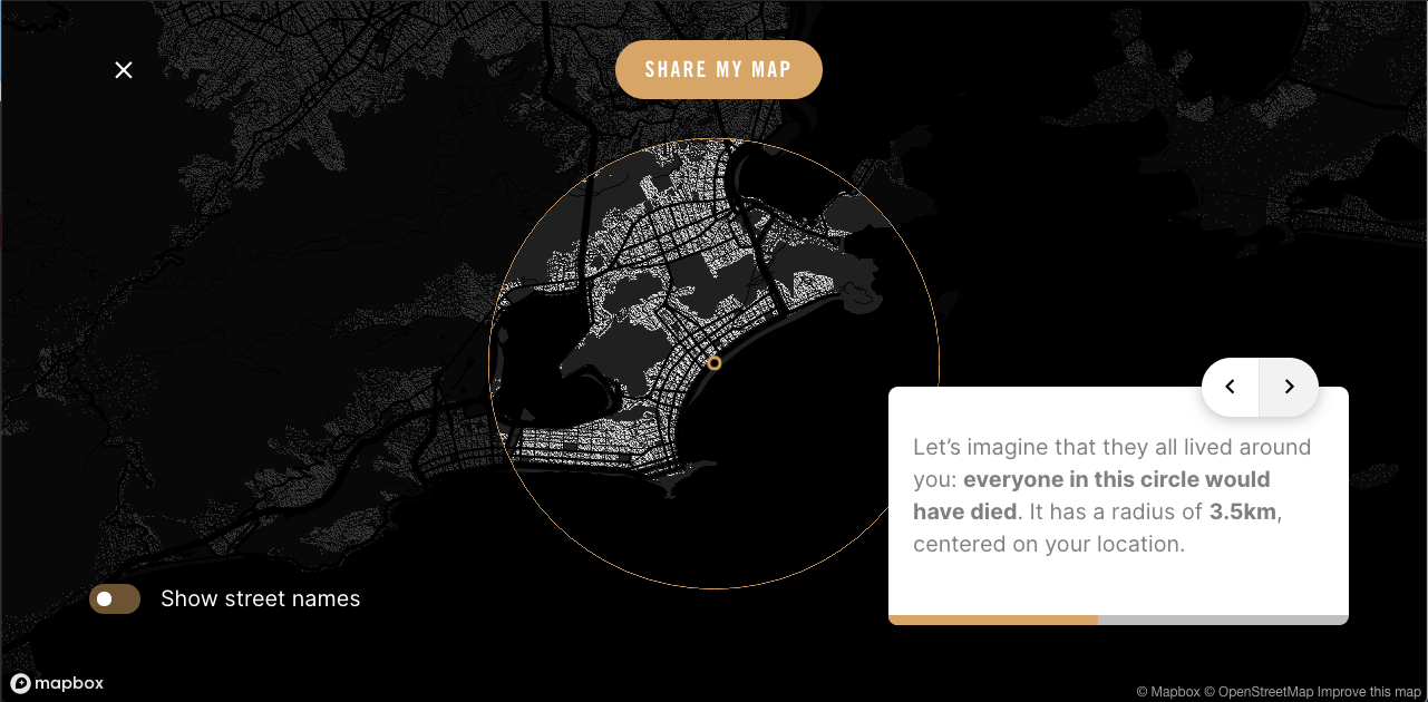
"No epicentro" is a data visualization tool created with the aim of alerting to the amazing numbers of Covid-19 deaths in Brazil. Up until 2021 January 5th, over 196,000 people had died due to Covid‑19 in the country. But it can be difficult to visualize it so we thought: what if all these deaths had happened near you? Since major Covid‑19 outbreaks happened in metropolitan areas, many Brazilians don’t see the effects of the disease in their daily lives. This simulation was created to make the dimension of our losses easier to understand. We later adapted the project for the United States in collaboration with “The Washington Post”.
Team
Rodrigo Menegat (Data and Storytelling), Vinicius Sueiro (Design and Development), Tiago Maranhão (Maps and Development), Alberto Cairo (Art direction), Gilberto Scofield Junior and Natalia Leal (Agencia Lupa), Marco Tulio Pires (Google News Initiative)
Awards
🏆 Best in Show (small teams) — Society for News Design, 🏆 Best Dataviz in Latin America (update: and Worldwide! 🥳) — Digital Media Awards, World Association of Newspapers and News Publishers, 🏆 Sigma Award for Data Journalism, 🥉 Bronze Medal (Innovation) — Malofiej
Project Websites
Brazilian version in Portuguese
USA version (in collaboration with The Washington Post)